A new corporate identity for Montfort

March 23, 2017 - You may have noticed a new logo on our website, our social media networks, and gradually, throughout the hospital.
Our previous logo represented Montfort with pride from 1973 to 2017. After 44 years of loyal service, this logo deserved to be updated to reflect our new status as an academic hospital and our presence on the list of Canada’s Top 40 Research Hospitals.
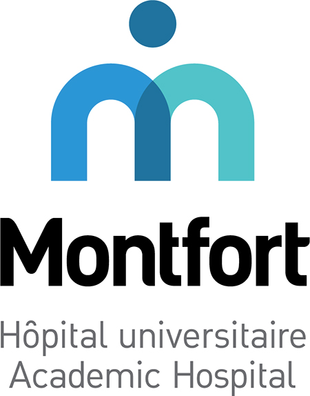
The new Montfort logo pays tribute to our past, with our values of excellence, compassion and respect; it still carries the M of Montfort; it remains "person-centered" and recognizes the three pillars of an academic hospital (exemplary care, practical teaching and research).
The new image is also more agile, more fluid, like our hospital.
The combination of the " Montfort blue" and turquoise illustrates the collaboration
- between patient and caregivers,
- between student and supervisor,
- between researcher and participant in a research project,
- etc.
By creating a new colour at the centre of this collaboration, the new logo demonstrates the values of mutual support and accountability, or how "together, we are stronger!"
And the logo now simply refers to "Montfort", since this is how people call OUR hospital. We are being cared for “at Montfort”, we visit a friend “at Montfort”, our children were born “at Montfort”...
Above all, the extended version of the logo states, loud and clear, that Montfort is an academic hospital... Ontario’s Francophone academic hospital!
